Dorkbot is a semi-monthly meeting of “people doing strange things with electricity.” They have been chugging along in several cities for a decade-or-so. Back in 2005 I presented at a Dorkbot in London, so I have an enduring soft spot for these quirky gatherings. At this month’s Dorkbot in San Francisco, a meteorologist named Tim Dye presented a brilliant visualization called WeatherDots. It summarizes the weather data he collects near his home in wine country.
Inspired by how much time-series information Dye was able to squeeze onto a few pretty circles, I spent the plane ride to ABS East in Miami throwing together a “dot” visualization of the Altos Research weekly active market data. Here is a visualization of a year’s worth of real estate data:
http://www.altosresearch.com/customer/labs/redots.html
My Redots updates every week, and can be pointed at any of the Altos Research local markets by entering a city, state, and zipcode. Your web browser needs to play nicely with the amazing Raphaël visualization library, or you will just get a blank screen. I recommend using Google Chrome.
The Legend, or What Is It?
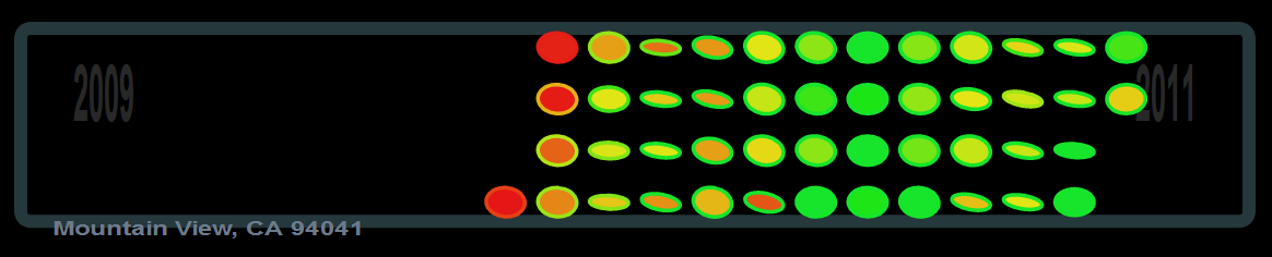
Each dot of color represents a week in a local residential real estate market, so each column is a month. The main color of the dot shows the week-on-week change in the median price of single family homes in a particular zipcode. A red dot means house prices have decreased since the previous week (or dot), while green dots are increasing weeks. The summer seasonality effect is pretty clear in our Mountain View, CA example.
The “halo” of a dot is the ratio of new listings to listings in general. If the newest listings coming onto a market are priced higher than the typical listing, then the halo will be green. This suggests a seller’s market, when new listings are asking for a premium. The price of these new listings will be absorbed into the market the following week, so you might imagine a dot’s halo merging with the main color.
A dot’s angle is the year-on-year change in market prices. Aiming northeastward means prices have increased since the year before, while southeast is a decrease. These angles strip away seasonality from the market, and show how secular real estate trends. Our Silicon Valley example is a bit down year-on-year. The thickness of a weekly dot represents the week-on-week change in the number of listings, put more simply, the inventory. Thin dots that are more ellipsoid are a shrinking market, where fewer listings are available for sale at any price.
A Thousand Words
Information visualization is a buzzy field with smart people doing striking work. For me the line between the big data and infovis communities blurs when a pretty picture enables statistical inference without necessarily running the numbers.
Hi Ben,
I recently came across your blog. You have many insightful posts. I especially find the redots visualization useful. If you don’t mind me asking – how do you go about creating it? I have recently started using Protoviz (rwebvis package in R) but find your work interesting. Appreciate the feedback.
You might like:
http://www.infosthetics.com
http://www.visualcomplexity.com
Hi Shal,
Thanks for reading! I used the Raphael JavaScript graphics library ( http://raphaeljs.com/ ) for the Redots visualization, which I find more straightforward than the Protovis / D3 lineage.
Funnily enough, I was featured on the Visual Complexity site ages ago for a food flavor pairing project ( http://www.visualcomplexity.com/vc/project.cfm?id=155 ).