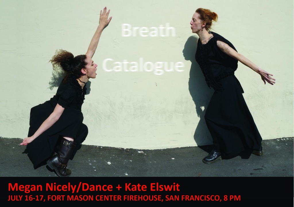
Breath Catalogue is a collaborative work by artist/scholars Megan Nicely and Kate Elswit, and data scientist/interaction designer Ben Gimpert, together with composer Daniel Thomas Davis and violist Stephanie Griffin. The project combines choreographic methods with medical technology to externalize breath as experience. Dance artists link breathing and movement patterns in both creation and performance. In Breath Catalogue, the goal is to expand the intrinsic dance connection between breath and gesture by visualizing and making audible the data obtained from the mover’s breath, and inserting this into the choreographic process to make the breath perceptible to the spectator. To do so, they are working with prototypes of breath monitors from the San Francisco-based startup Spire. Following the San Francisco premiere, Katharine Hawthorne interviewed Ben Gimpert to understand the inner workings of the technology interaction.
Katharine Hawthorne: What is the output of the breath sensor (what does it “measure”), and how does this get manipulated or translated into the visualizations?
Ben Gimpert: The sensor measures four things: the diaphragmatic or chest pressure placed on the device, as well as three dimensions of acceleration. These four numbers are sampled about thirty times per second, and then sent over Bluetooth radio to a laptop.
Is there latency in the sensor, in other words, how quickly is information transmitted and processed?
There is very little latency between sampling and receiving the data via Bluetooth on the computer. However, there are lot of complications. First the Bluetooth transmitter in the breath sensor can be easily disrupted or interfered-with by other radio frequency devices. Ironically, a dancer’s body can also block the radio transmitter in the device.
There is also an important but nuanced frame-of-reference problem when using this sort of sensor in performance: The breath sensor does not know the Euclidean origin of the space, what acceleration might occur at point (0, 0). It similarly does not know what is the beginning or end of a breath’s pressure. For this reason, the different breath visualizations avoid working with much memory of a breath. They always work from the difference between this moment’s breath pressure, and the last moment one thirtieth of a second ago. For the mathematically inclined, the viz uses plenty of moving averages and variance statistics. These moving averages give an intentional sort of latency, as Kate or Megan’s movement eases into the visuals.
I am curious about how you chose the specific graphics and visuals used in the piece (the lines and the other projected images).
The famous Joy Division album cover. Smoky particles at a rave in the nineties. The dancers wanting their breath to leave an almost-real residue in the space.
In each case the breath is not visualized literally, because that would be boring. If the pressure sensor has a low reading, suggesting that Kate or Megan is at an inhale, the code might move the frequency blanket imagery in a snapped wave upward. Or invert the breath by sending the neon bars outwards.
Relatedly, how much did you collaborate with the lighting designer on integrating the data visualizations into the overall visual landscape of the performance?
Alan [Willner] was great. He designed the lighting based on videos we sent him of the piece and the visualizations ahead-of-time.
Who is driving the collaboration? Did the dancers/choreographers suggest modes of interaction and then the visuals develop to suit the choreography? Or did the possible visualizations shape the movement landscape?
I have seen a lot of contemporary dance where an often-male technologist projects his video onto usually-female dancers. This is both sloppy politics, and pretty lazy. I wanted there to be a genuine feedback loop between what my code would project in the space, and how Kate and Megan move. So I was in the dance studio with the dancers throughout the creation of the piece.
Can you provide an example of a section where the “movement” led the development and/or a section where the “tech” led? I want to understand this feedback loop better. How was this process different than a traditional dance/tech collaboration?
The tech side of a typical tech/dance collaboration starts with an existing piece of software like MaxMSP or Isadora. The tech person puts together a couple cool looking visualizations, and then brings these along to the studio. In rehearsal, the visualizations are typically put on in the background while the dancers “interpret” or literalize the visualization with their bodies. This produces a lot of great looking stuff, but there is very little feedback going either direction. In Breath Catalogue, we developed a custom piece of software specifically for the piece. This custom approach with a hardware prototype like the sensor and avoided a proprietary (commercial) software dependency. In a very practice-as-research sense, I would often make live changes to the code while in the studio. The Breath Catalogue visualizations run in a web-browser, so it was easy for Kate and Megan to run them outside of the studio. at home. We are planning to release the Breath Catalogue software under an open source license, to support the community. (Some utility is already released on Github.)
A few specific examples of tech/dance collaboration in Breath Catalogue: At one point I was dragging the virtual 3D camera around the frequency blanket visualization (i.e. Joy Division). Kate and Megan asked me to hold at the point when the viz was like a roof above their heads. They developed some movement vocabulary based on this metaphor, and then later I made modifications to the JavaScript code so the roof looked more naturally lit. Another time, on a whim, Kate and Megan noticed that the breath sensor does a heightened job of tracking breath when the dancer is physically against a wall. That was the genesis of the “wall pant” section. My aesthetics run toward grand gestures and the baroque. In general, contemporary dance tends to minimalism and the referential, which nudged the visualizations toward abstract shapes and muted colors.
How much communication occurs between you and the performers throughout the performance?
Quite a bit. The breath sensor was an unpredictable aspect of the performance, but we three did not want to fake it. So we decided to err on adaptivity instead of pre-recording everything, and this meant a lot of thumbs-up & down cues during the transitions which Hope Mohr noticed for her review. Some of our music was cued off of Kate or Megan taking a certain shape, while at other points the dancers were waiting on the sensor’s connection.
There’s a moment in the piece when the Megan takes off the sensor and transfers it to Kate. Is their breath data significantly different? Also, has this moment ever caused any technical difficulties? Does the sensor have to recalibrate to a different body?
Yes, Kate and Megan each have a distinct style of breathing. If you are adventurous, this can be teased out of the breath data we posted online. In this piece, Megan’s breath is usually more staccato and Kate’s sustained. The sensor reconnects at several points, which is technically challenging. In the next iteration of Breath Catalogue, we will be using multiple sensors worn by one or more dancers. The visualization software that I built already supports this, but it is trickier from a hardware standpoint.
In your experience, how much of the data visualizations translate to the audience? How easy is it for an untrained eye to “get” what is going on and understand the connection between the performer’s breathing and the images?
It turns out to be quite difficult. We added a silent and dance-less moment at the beginning of the piece so the audience could understand the dancer’s breath’s direct effect on the viz. Yet, even with that, the most common question I have been asked about my work with Breath Catalogue was about the literal representation of the breath. As contemporary dance audiences, we are accustomed to referential and metaphorical movement. However I think visualizations are still expected to be literal, like an ECG. Or just decorative.
What is your favorite part of the piece?
In the next-to-last scene, the wireless pocket projector was reading live sensor data from the dancer via the attached mobile phone. Which was pretty fucking tough from a technical standpoint. Also the whimsical moment when Kate watches and adjusts her breath according to the baseline of that Police song. And when Megan grabs the pocket project for the film noir, and then bolts.
If you had the time to rework or extend any section, which would it be?
In one scene we remix the live breath data with data from earlier in that evening’s show. I would have made this more obvious to the audience, because it could be a pretty powerful way to connect breath and time passing.