Dan Rice on How the Experts May Not Always Be Right: A Story About the Discovery of Preclinical Alzheimer’s Disease in 1991

Machine learning can be a check on conventional thinking, if we let it.

On the new analytics Linkedin group started by Vincent Granville, Dan Rice wrote a personal account of his frustrations with the Alzheimer’s research of 20 years ago, before we understood more about the preclinical period of the disease:

The problem that I have with domain expert knowledge selecting the final variables that determine the model is that it no longer is data mining and it often is no longer even good science. From the time of Galileo, the most exciting and important findings in what we call science are those data-driven findings that prove the experts wrong. The problem is that the prior domain knowledge is usually incomplete or even wrong, which is the reason for research and analytics in the first place. I understand that the experts are helpful to generate a large list of candidate variables, but the experts will often be wrong when it comes to determining how, why and which of these variable combinations is causing the outcome.

I had an experience early in my research career that has made me forever distrustful of the expert. I was doing brain imaging research on the origins of Alzheimer’s disease in the early 1990’s and all the experts at that time said that the cause of Alzheimer’s disease must be happening right when the dementia and serious memory problems are observed which may be at most a year before the ultimate clinical diagnosis of dementia consistent with Alzheimer’s. We took a completely data-driven approach and measured every variable imaginable in both our brain imaging measure and in cognitive/memory testing. From all of these variables, we found one very interesting result. What the experts had referred to as a “silent brain abnormality” that is seen in about 25% of “normal elderly” at age 70 was associated with minor memory loss problems that were similar to but much less severe than in the early dementia in Alzheimer’s disease. We knew that the prevalence of clinically diagnosed dementia consistent with Alzheimer’s disease was 25% in community elderly at age 80. Thus, we had a very simple explanatory model that put the causal disease process of Alzheimer’s disease back 9-10 years earlier than anyone had imagined.

The problem was that all the experts who gave out research funding disagreed and would not even give me another grant from the National Institute on Aging to continue this research. For years, nobody did any of this preclinical Alzheimer’s research until about 10 years ago when people started replicating our very same pattern of results with extensions to other brain imaging measures. What is still controversial is whether you can accurately PET image the beta-amyloid putative causal protein in living patients, but it is no longer controversial that Alzheimer’s has an average preclinical period of at least 10 years. Ironically, one of the experts who sat on the very committee that rejected my grant applications suddenly became an expert in preclinical Alzheimer’s disease over the past 5 years. The experts are very often dead wrong. We allow experts to select variables in the RELR algorithm, but our users tell us that they seldom use this feature because they want the data to tell the story. The data are much more accurate than the experts if you have an accurate modeling algorithm.

(Quoted with permission of the author.)
Housing Finger in the Air

The March, 2011 Case-Shiller numbers will be released this Tuesday, but the CME’s May futures contracts expire tomorrow. Some of the real estate transactions that will be summarized in Tuesday’s numbers are up to five months old, where our data is at most one week old. This is why Altos Research calls its statistics “real time,” since it is an order of magnitude more current than the benchmark in real estate data.

Below is a table of our forecasts for six of the Case-Shiller futures contracts. Check back in a few days, when I will compare with the actual March, 2011 numbers.

Metro Area Feb-2011 CS HPI Forecast Signal
Boston, MA 149.86 -2.33% 111bps below the future’s spot bid price
Chicago, IL 113.26 -1.28% in the spread
Denver, CO 121.26 -3.31% 64bps below the future’s spot bid price
Las Vegas, NV 98.28 -3.26% 96bps below the future’s spot bid price
Los Angeles, CA 168.25 -8.64% 763bps below the future’s spot bid price
San Diego, CA 155.05 +1.66% 209bps above the futures spot ask price
(all spot prices as of 10:30am PST on 26-May-2011)

Fighting the Last War: Shiller Paper

A new type of mortgage gets a price that means you never have to walk away.

Last month Robert J. Shiller, Rafal M. Wojakowski, Muhammed Shahid Ebrahim and Mark B. Shackleton published a paper with the financial engineering to price “continuous workout mortgages.” This is the Shiller of Irrational Exuberance and housing index fame.

A continuous workout mortgage leaves some of the risk of house price deprecation with the mortgage lender, since the mortgage balance automatically adjusts if the market tanks. The authors model an interest-only continuous workout mortgage as a loan bundled with a put option on the value of the home and a floor on interest rates. By design, the option to abandon the mortgage is always out of the money, so the borrower has little incentive to strategically default or walk away.

Pricing a continuous workout mortgage uses a standardized housing index. Perversely, this prevents a borrowers from trashing their own homes in order to reduce payments. So the bundled put option is on a housing index and not on the exact home. Others have written about the political and class bias encouraged when your savings are connected so directly to the neighborhood. Standard & Poor’s conveniently sells metropolitan housing indices. These S&P Case-Shiller housing indices have serious problems, including methodology transparency and data lag — no one can replicate and therefore validate the Case-Shiller numbers, the indices are published several months late, and they ignore the prices of homes pulled off the market without a sale.

Like proper quants, Shiller and colleagues push hard for a closed-form pricing formula. The party line is that clean formulas make for better markets, but computer simulation is easy enough now-a-days and far more accurate. Ahh, job security! To get a formula for the interest rate a lender should charge for a continuous workout mortgage, they make the heroic Black-Scholes universe assumptions, including:

  • The housing index can be traded, and traded without any brokerage fees. Also the index can be sold or bought for the same price.
  • Cash can be borrowed or lent at the exact same interest rate.
  • No one pays taxes.
  • The variance (jitter) in the housing index is independent of how much a trader expects to earn from investing in the housing index. This one is rarely mentioned, but not so obscure once you drop the “risk neutral” jargon.

And so also like proper quants, Shiller and his colleagues assume the frictionless, massless pulley from a high school physics class.

Dreaming of the Cloud

So far cloud 2011 is just client-server 1997 with new jargon.

As a modeler who manages a serious EC2 cluster, someone who has handed thousands of dollars to Amazon over the last few years, I remain frustrated at what the industry has settled on as the main unit of value. Root access on a Linux virtual machine does an admirable job of isolating my applications from other users, but it is a poor way to economically prioritize. We need a smarter metaphor to distribute a long-running job across a bunch of machines and to make sure we pay for what we use. I don’t so much care about having a fleet of machines ready to handle a spike in web traffic. Instead I want to be able to swipe my credit card to ramp up what would usually take a week, so it will finish in a couple hours.

(If you are a Moore’s Law optimist who thinks glacial, CPU-bound code is a thing of the past, you might be surprised to hear that one of my models has been training on an EC2 m1.large instance for the last 14 hours, and is just over halfway finished… Think render farms and statistical NLP, not Photoshop filters.)

My dream cloud interface is not about booting virtual machines and monitoring jobs, but about spending money so my job finishes quicker. The cloud should let me launch some code, and get it chugging along in the background. Then later, I would like to spend a certain amount of money, and let reverse auction magic decide how much more CPU & RAM that money buys. This should feel like bidding for AdWords on Google. So where I might use the Unix command “nice” to prioritize a job, I could call “expensiveNice” on a PID to get that job more CPU or RAM. Virtual machines are hip this week, but applications & jobs are still the more natural way to think about computing tasks.

This sort of flexibility might require cloud applications to distribute themselves across one or more CPUs. So perhaps the cloud provider insists that applications be multi-threaded. Or Amazon could offer “expensiveNice” for applications written in a side-effect free language like Haskell, so GHC can take care of the CPU distribution.

Banks from the Outside

How do you identify the big cheese at a bank, the decision maker you should sell to? It’s not as easy as it sounds.

Investment banks are notoriously opaque businesses with a characteristic personnel and power structure. Still, there is plenty in common across investment banks and a few generalizations an outsider can make when trying to deal with an investment bank.

The “bulge bracket” are the large investment banks. Bank pecking order and prestige is roughly based on a bank’s size and volume of transactions. Banks who do the most deals generate the highest bonus pool for their employees. The pecking order since the credit crisis is probably:

This list is obviously contentious — though Goldman Sachs and JPMorgan are the undisputed masters, and Citibank and BofA are both the train wrecks. BofA is also known as Bank of Amerillwide, given its acquisitions. Bear Stearns opted out of the 1998 LTCM bailout, which is probably why they were allowed to fail during the credit crisis. Lehman Brothers had a reputation for being very aggressive but not too bright, while Merrill Lynch was always playing catchup. NYC is the capital of investment banking, but London and Hong Kong trump in certain areas. I’ve indicated where each of the bulge brackets are culturally headquartered. Each bank has offices everywhere but big decision-makers migrate to the cultural headquarters.

Investment Bank Axes

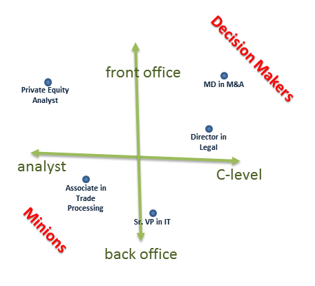
There are two broad axes within each bank. One axis is “front office -ness” and the other axis is “title” or rank. The front office directly makes serious money. The extreme are those doing traditional investment banking services like IPO’s, M&A, and Private Equity. And of course, traders and (trading) sales are also in the front office. Next down that axis are quants and the research(ers) who recommend trades. Then the middle office is risk management, legal and compliance. These are still important functions, but have way less pull than the front office. The back office is operations like trade processing & accounting, as well as technology.

This first front office -ness axis is confusing because people doing every type of work turn up in all groups. JPMorgan employs 240 thousand people so there are bound to be gray areas. An M&A analyst might report into risk management, which is less prestigious than if the same person with the same title reported into a front office group.

The other axis is title or rank. This is simpler, but something that tends to trip up outsiders. Here is the pecking order:

  • C-level (CEO, CFO, CTO, General Counsel. Some banks confusingly have a number of CTOs, which makes that title more like:)
  • Managing Director (“MD”, partner level at Goldman Sachs, huge budgetary power, the highest rank we mere mortals ever dealt with)
  • Executive Director or (just) Director (confusingly lower in rank than an MD, still lots of budgetary power)
  • Senior Vice-President (typical boss level, mid-level management, usually budgetary power, confusingly lower in rank than a Director)
  • Vice-President (high non-manager level, rarely has budget)
  • Assistant Vice-President or Junior Vice-President (“AVP”, rookie with perks, no budget)
  • Associate or Junior Associate (rookie, no budget)
  • Analyst (right out of school, no budget, a “spreadsheet monkey”)
  • Non-officers (bank tellers, some system administration, building maintenance)

Almost everyone at an investment bank has a title. Reporting directly to someone several steps up in title is more prestigious. Contractors and consultants are not titled, but you should assume they are one step below their boss. If someone emphasizes their job function instead of title (“I’m a software developer at Goldman Sachs”), you should assume they are VP or lower. Large hedge funds and asset managers mimic this structure. So to review, who is probably a more powerful decision maker?

  • A. an MD in IT at BofA, based out of Los Angeles -or- B. an ED in Trading also at BofA, but based in Charlotte (highlight for the answer: B because front office wins)
  • A. an MD in Risk Management at Morgan Stanley in NYC -or- B. a SVP in M&A also at Morgan Stanley in NYC (A because title wins)
  • A. a Research Analyst at JPMorgan in NYC -or- B. a Junior Vice-President in Research at Citibank in London (A because NYC and front office wins)
  • A. a VP Trader at Morgan Stanley in Chicago -or- B. an SVP in Risk Management at UBS in London (toss up, probably A since traders win)
  • A. an Analyst IPO book runner at Goldman Sachs in NYC -or- B. an Analyst on the trading desk at JPMorgan in NYC (toss up, probably A because Goldman Sachs wins)

Sour Grapes: Seven Reasons Why “That” Twitter Prediction Model is Cooked

The financial press has been buzzing about the results of an academic paper published by researchers from Indiana University-Bloomington and Derwent Capital, a hedge fund in the United Kingdom.

The model described in the paper is seriously faulted for a number of reasons:

1. Picking the Right Data
They chose a very short bear trending period, from February to the end of 2008. This results in a very small data set, “a time series of 64 days” as described in a buried footnote. You could have made almost 20% return over the same period by just shorting the “DIA” Dow Jones ETF, without any interesting prediction model!

There is also ambiguity about the holding period of trades. Does their model predict the Dow Jones on the subsequent trading day? In this case, 64 points seems too small a sample set for almost a year of training data. Or do they hold for a “random period of 20 days”, in which case their training data windows overlap and may mean double-counting. We can infer from the mean absolute errors reported in Table III that the holding period is a single trading day.

2. Massaging the Data They Did Pick
They exclude “exceptional” sub-periods from the sample, around the Thanksgiving holiday and the U.S. presidential election. This has no economic justification, since any predictive information from tweets should persist over these outlier periods.

3. What is Accuracy, Really?
The press claims the model is “87.6%” accurate, but this is only in predicting the direction of the stock index and not the magnitude. Trading correct directional signals that predict small magnitude moves can actually be a losing strategy due to transaction costs and the bid/ask spread.

They compare with “3.4%” likelihood by pure chance. This assumes there is no memory in the stock market, that market participants ignore the past when making decisions. This also contradicts their sliding window approach to formatting the training data, used throughout the paper.

The lowest mean absolute error in predictions is 1.83%, given their optimal combination of independent variables. The standard deviation of one day returns in the DIA ETF was 2.51% over the same period, which means their model is not all that much better than chance.

The authors also do not report any risk adjusted measure of return. Any informational advantage from a statistical model is worthless if the resulting trades are extremely volatile. The authors should have referenced the finance and microeconomics literature, and reported Sharpe or Sortino ratios.

4. Backtests & Out-of-sample Testing
Instead of conducting an out-of-sample backtest or simulation, the best practice when validating an un-traded model, they pick the perfect “test period because it was characterized by stabilization of DJIA values after considerable volatility in previous months and the absence of any unusual or significant socio-cultural events”.

5. Index Values, Not Prices
They use closing values of the Dow Jones Industrial Average, which are not tradable prices. You cannot necessarily buy or sell at these prices since this is a mathematical index, not a potential real trade. Tracking errors between a tradable security and the index will not necessarily cancel out because of market inefficiencies, transaction costs, or the bid/ask spread. This is especially the case during the 2008 bear trend. They should have used historic bid/ask prices of a Dow Jones tracking fund or ETF.

6. Causes & Effects
Granger Causality makes an assumption that the effects being observed are so-called covariance stationary. Covariance stationary processes have constant variance (jitter) and mean (average value) across time, which is almost precisely wrong for market prices. The authors do not indicate if they correct for this assumption through careful window or panel construction.

7. Neural Parameters
The authors do not present arguments for their particular choice of “predefined” training parameters. This is especially dangerous with such a short history of training data, and a modeling technique like neural networks, which is prone to high variance (over-fitting).

Getting Bought

I am happy to announce that I just signed the paperwork to transfer my machine learning software to Altos Research, where my position is now Director of Quantitative Analytics. Altos and I have been working together on a contract basis since last November, when I started forecasting with the Altos data. The software itself (“Miri”) is my professional obsession — a programming library for data mining, modeling and statistics. Miri was the core of the FVM product we released in February (http://www.housingwire.com/2011/02/07/altos-unveils-forward-looking-valuation-model).

Altos Research LLC is a real estate and analytics company founded back in 2005. We are about 15 people in Mountain View, CA who collect and analyze live real estate prices and property information from the web. Altos is not just “revenue positive,” but actually profitable. We are proud to have never taken outside funding.

Altos will continue to develop Miri, but I will also focus on technical sales, business development and my own trading portfolio. We have a serious opportunity to change the way the financial industry’s dinosaurs do modeling. I am still your friendly neighborhood data guy, just now mostly thinking about real estate.

My personal blog is at “http://blog.someben.com/”, where you can read my ramblings. And I talk shop on the Altos blog itself at “http://blog.altosresearch.com/”.