Or, why clams are bourgeois — the presence of clams on menus is indicative of a place where people spend a lot of their money on housing. This is how I found out.
We have all played the proportional rent affordability game. How much of my income should I spend on where I live? One rule of thumb is “a third,” so if you take home $2,400 per month you aim to spend about $800 on rent or a mortgage payment. Some play the hypothetical budgeting version of the game. We might pay more of our income for housing if it means being able to live in a particularly desirable area.
Expensive Housing
Here is a map of income normalized by housing expense, for a bunch of Bay Area neighborhoods. This information is from our Altos Research active market real estate data. More technically, each dot on the map represents the ratio of a zipcode’s household income to the weighted average of single family home list prices and multi-family home list prices. I used median numbers, to minimize the impact of foreclosures or extremely wealthy households. Single and multi-family home prices were weighted by listing inventory, so urban condos matter as much as those McMansions in the ‘burbs. The green dots are areas where proportionally more income is spent on housing, and blue dots are the opposite.
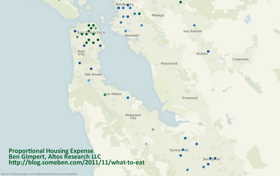
The data shows that people living in the city of San Francisco spend a much larger proportion of their income on housing than Oaklanders or those in San Jose. If we assume that the real estate market is somewhat efficient, then those who choose to live in certain neighborhoods forgo savings and disposable income. Why is it that housing expenses for living in San Francisco are so much higher than San Jose, even when we control for income disparity?
The Real Estate Menu
Like a proper hack economist, I am going to gloss over the obvious driving factors of proportionally expensive housing, such as poor labor mobility, lack of job opportunities, and a history of minority disenfranchisement. I am a chef by training — culinary arts degree from CHIC, the Le Cordon Bleu school in Chicago — and remain fascinated by the hospitality industry. So instead of diving into big social problems, I focused on something flippant and easy to measure: Where people go out to eat, across areas with different levels of proportional housing expense.
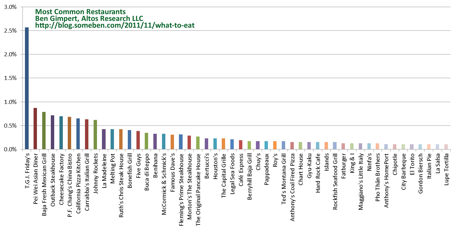
I analyzed the menus of a random selection of 5,400 sit-down and so-called “fast casual” restaurants across the United States. This menu population is hopefully large and diverse enough to represent dining out in general, though it is obviously biased toward those restaurants with the money and gumption to post their menus online. However there is not a disproportionate number of national chain restaurants, since even the most common restaurant, T.G.I. Friday’s, is only about 2.5% of the population:
Menu Words
The next step in my analysis was counting the common words and phrases across the menus. Here are the top fifty:
Pervasive ingredients like “chicken” turn up, as do common preparation and plating terms like “sauce” and “topped-with”. Perhaps my next project will be looking at how this list changes over time. For example, words like “fried” were taboo in the 90’s, but more common during this post-9/11 renaissance of honest comfort food. Now-a-days chicken can be “fried” again, not necessarily “crispy” or “crunchy”.
A Tasty Model
Next I trained a statistical model using the menu words and phrases as independent variables. My dependent variable was the proportional housing expense in the restaurant’s zipcode. The model was not meant to be predictive per se, but instead to identify the characteristics of restaurant menus in more desirable areas. The model covers over five thousand restaurants, so menu idiosyncrasy and anecdote should average out. The algorithm used was our bespoke version of least-angle regression with the lasso modification. It trains well on even hundreds of independent variables, and highlights which are most informative. In this case, which of our many menu words and phrases are correlated with proportional housing expense?
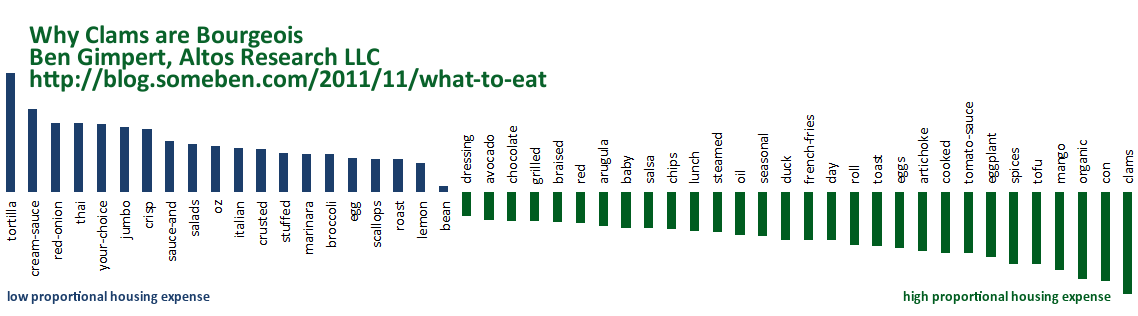
The twenty menu words and phrases most correlated with low proportional housing expense (the bluer dots) areas:
Several of these words of phrases are associated with ethnic cuisines (i.e. “thai” and “tortilla”), and others emphasize portion size (i.e. “jumbo” and “oz” for ounce). Restaurants in high proportional housing expense areas (greener dots) tend to include the following words and phrases on their menus:
These words reflect healthier or more expensive food preparation (i.e. “grilled” or “steamed”), as well as more exotic ingredients (i.e. “mango” and “clams”). Also, seasonal and organic menus are associated with low proportional housing expense. The word “con” turns up as a counter-example for Latin American cuisine, as in “con huevos” or “chili con queso”.
Food Crystal Ball
This sort of model for restaurant menus could also be used for forecasting, to statistically predict the sort of food that will be more successful in a particular neighborhood. This predictive power would be bolstered by the fact that the population of menus has a survivorship bias, because failed or struggling restaurants are less likely to post their menus online.
This confirms my suspicion that housing expense is counter-intuitive when it comes to dining out. People who spend more of their income on housing in order to live in a desirable location have less disposable income, but these are the people who pay more for exotic ingredients and more expensive food preparation. Maybe these folks can’t afford to eat in their own neighborhood?
I think this model might just be pointing out that restaurants with more exotic or expensive food preparations are more likely to be found in more affluent regions, which also would likely have higher real estate values and rents. The proportion of income spent on housing is more an indication of real estate prices rather than of people choosing to spend more on real estate.
I don’t think people move solely based on how much they would be spending on rent. They select a place to live based on myriad factors like economic opportunity, location and hence the categorisation. These places tend to have higher real estate prices and due to general economical advantages are perhaps also the places where more expensive food preparation is to be found. I think what you have discovered is a correlation and are ascribing a behavioral causation which may or may not exist.